
Written by Maxwell Giddens
Co-Creator along side Douglas “TopHATTwaffle” Hoogland of de_facade.
When you look at the finished product of most things, it’s hard to imagine the many individual parts that made them what they are. Often many of the details that define something are ones that aren’t even visible in the final version. A lot of decisions went into the design of de_facade, and while we think we made most of them for pretty good reasons, several of the results aren’t even visible in the map today. There is a whole untold story of what happened to get it to where it is now. This is (hopefully) an easily digestible form of that very long story.
Welcome to Facade (pronounced fuh-sahd, for anyone who hasn’t seen that word written before). As you adventure through our level, you may be thinking that it’s a remake, or is inspired by one of the existing maps in Counter Strike’s long history; this is not actually the case. The truth is this map was created in collaboration with players who have spent hundreds of hours playing and enjoying the game. With so much input from those players, it’s no accident that it feels so familiar. We hope you would agree that it fits in comfortably alongside the maps we all play so often.
Building an Original Layout
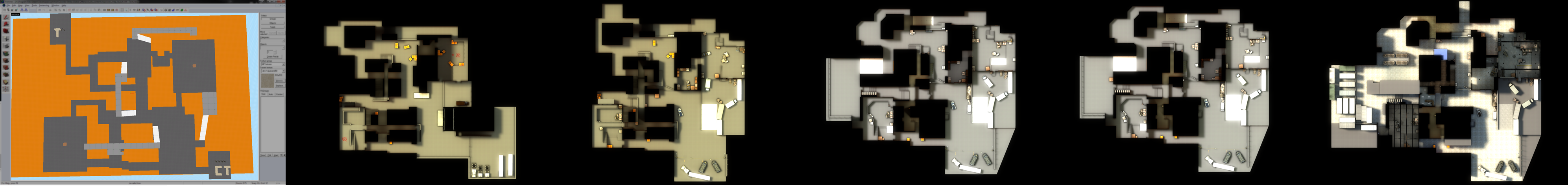
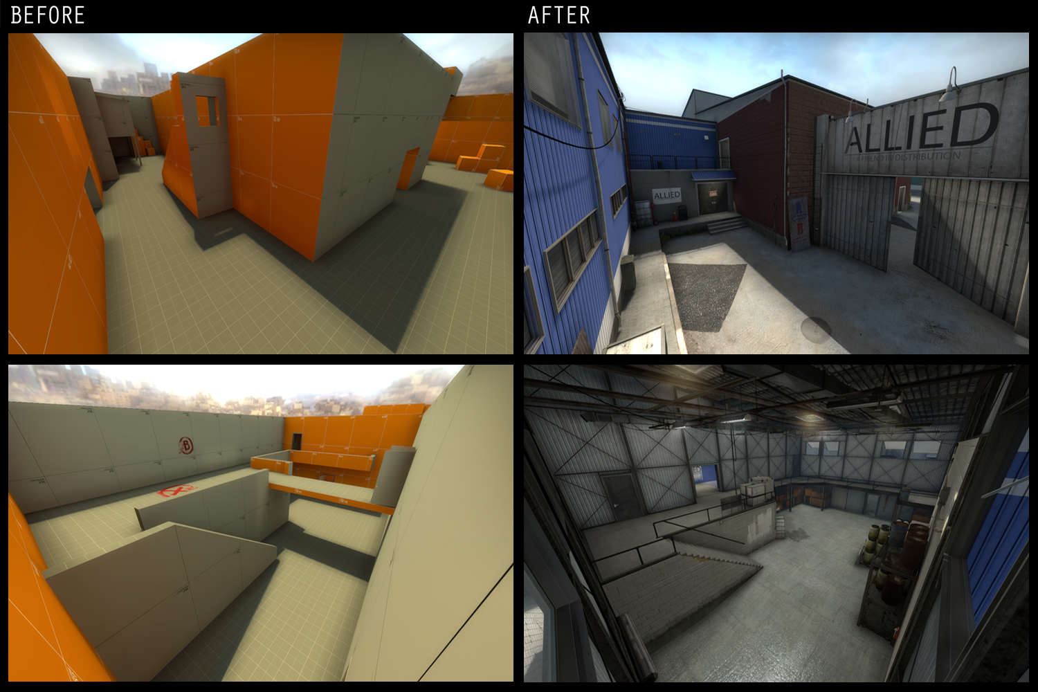
Since we began, Facade was played extensively in order to create a layout that directly reflects what long time time CS players are looking for. We created it with the goal of not only innovation, but also of understanding and meeting our players expectations. It was decided early in development to not grow too attached to any specific area of the map. Instead of investing time in building complex details, we adopted a “nothing is permanent” attitude in our playtests, and stuck to building only basic geometry. This decision paid off very early on by giving the final say to our players. Problem areas could be reworked to our players’ specifications without our personal preferences or pride getting in the way. This feedback loop would keep our ideas grounded, while keeping decisions for the sake of aesthetics out of the equation. It may seem like a no-brainer to not waste time on details early on, but it’s easy for an eager designer to fall into that trap when starting a new level.
With this strategy in mind, we began to create an initial layout. We could spend a large portion of time trying to defend the laughable decisions that we made when constructing the original layout for Facade, but thankfully, we both learned quickly that the instincts of our playtesters consistently trumped even our best laid plans. While our testers’ feedback was our most valuable asset at this stage, making changes to areas we felt certain we had right involved a level of frustration which we were not expecting so early on. It was a challenge for both of us to continually modify our layout when our work might need to immediately be undone or redone. As we pushed through, however, the level started to take shape. After a few weeks of our “build, test, modify, repeat” routine, we began seeing promising definition in our layout.
The biggest hole in our original layout was the lack of a well defined middle. As Counter Strike players know, the middle of the map is often the most crucial element in determining how a match will play out. Without one, our players felt more like rats wandering through a maze than players in a competitive environment. Instead of an easily readable middle to the map, we originally had two large paths that connected the bombsites; essentially there was one middle too many. Thankfully by watching several playtests and hearing our testers’ feedback, we were able to quickly identify and rework the area into what is now the ‘bridge’ area of the map. This change restricted one of the original middle paths to narrow corridors that connected to the middle, rather than a second open path that caused the issue.
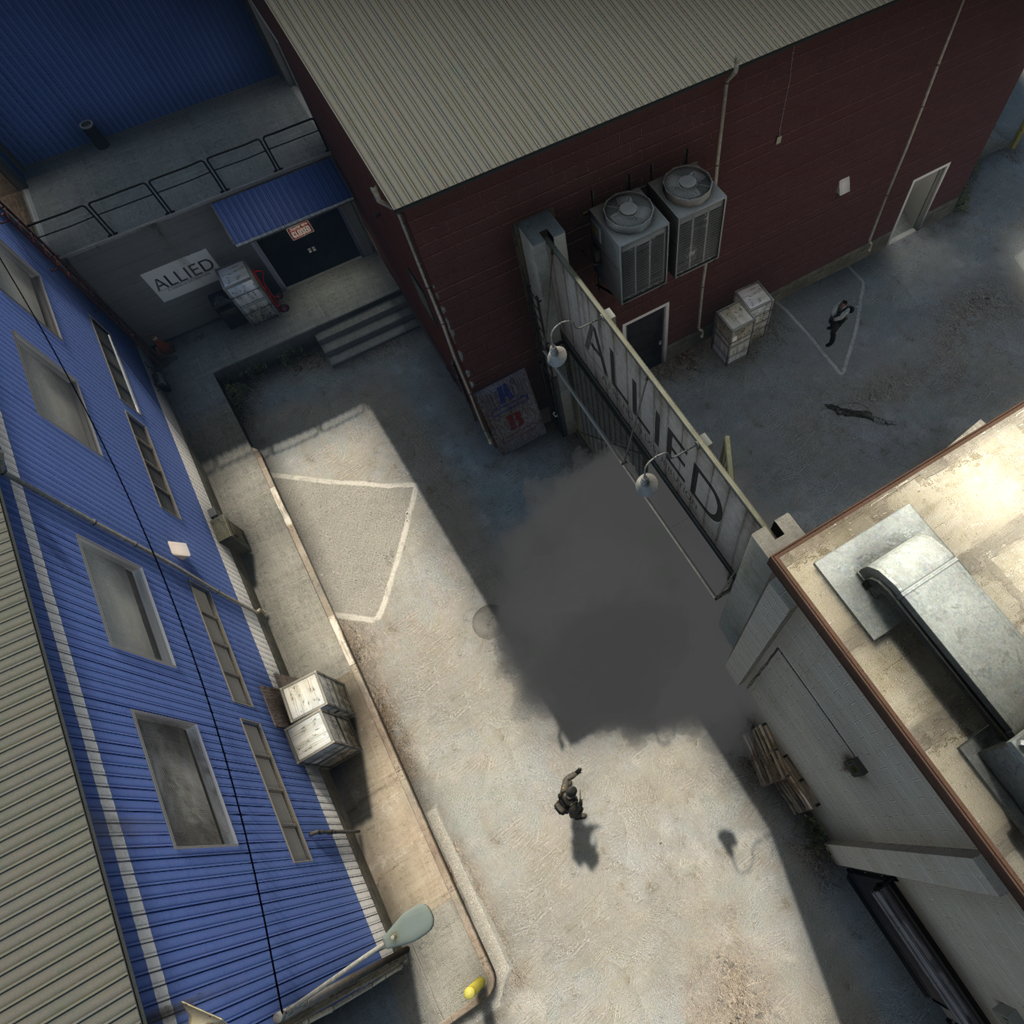
Perhaps the most unique things about the layout of facade are the bomb sites themselves. As you play the map you might realize that each bomb site offers a lot to consider. For instance in site A, terrorists start with the high ground. Because the site offers little in the way of cover, breaking the line of sight by using the different height levels is hugely important. Though seemingly small, this deviation from the norm can be very challenging, and requires players to create new strategies to effectively play the site. Similarly, site B breaks the norm by cranking up the scale of the standard bomb site. The increase in negative space lends itself to using cover the way you would in a typical middle while still offering counter points for strategic play. Both sites also include several ways to implement smokes and flashes, allowing for a range of offensive and defensive strategies.
 The counter to Facade’s open spaces can be found in the tight claustrophobic halls of the offices. This variation allows for players who are proficient at short range to shine, as controlling the offices can allow for fast rotates or equally powerful shutdowns. The many paths that feed into the offices make it challenging to hold, while offering large payoffs for strategic play. We wanted to make sure that such a high traffic area required serious thought to play effectively.
After thoroughly playtesting this layout we felt our shape was mostly pinned down, with only a few decisions up for debate. Interestingly, as we continued to test, we noticed our feedback had become increasingly particular. Our playtesters started reporting that some areas felt “off” without being able to give us a specific reason why. We realized that players were subconsciously frustrated because of the contrast between the gameplay, which we worked to smooth, and the then-unfinished visuals. We decided that in order to continue receiving valuable feedback, we would need to begin refining the map’s visual details.
A New-Old Design
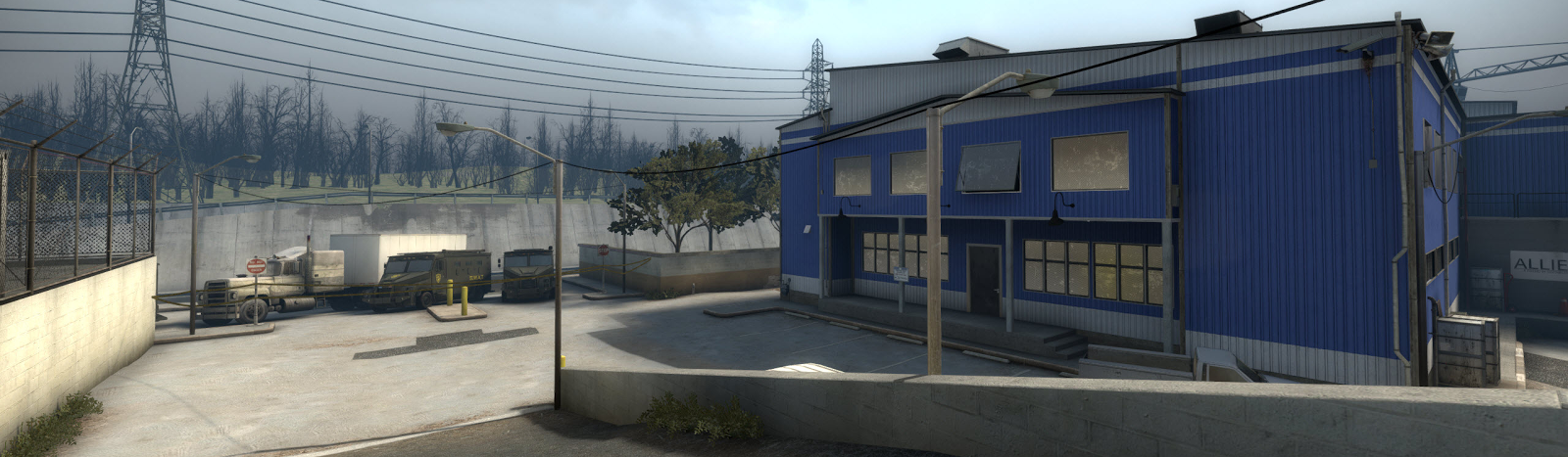
Before we could begin adding detail, we needed a concrete aesthetic direction. Since the map at that point consisted of simple moldable shapes, there were quite a few avenues that could have been pursued for visuals. The shipping yard style that you see now is actually the result of a conversation that we had about the signs that direct players to bomb sites in most levels. We thought that it was odd that these signs were there before the terrorists arrived. After all, if terrorists had time to make signs, why would they wait for counter-terrorists to arrive before they blew the place up? We decided that it was more logical for terrorists to have already occupied the space in which the map took place. To provide a reason for the terrorists to destroy their own turf, we thought that the map might be set in the headquarters of a business whose shady dealings the terrorists would need to hide. So then the name Facade and the stripped-down factory style were decided, and we could begin looking for real-world examples to base our designs off of.
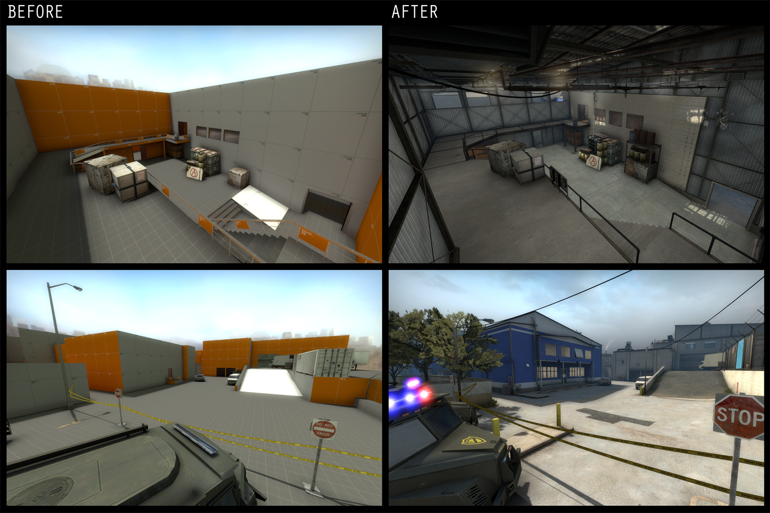 We did a great deal of research on the look of factories, plants, industrial warehouses and anything that could fit our narrative to get a clearer idea of what these places really look like. As you might imagine, an array of colorful corrugated warehouse buildings showed up in just about all of these searches, and we clearly embraced them. Thanks to the extensive searching, we also decided a shipping yard seemed to be the best fit for our level’s shape. These references, combined with the idea of a business that was stripped down and run by criminals, provided us a very developed visual style to build off of. The resulting aesthetic is new with many vibrant, hand-made textures, but is also familiar, pairing nicely with the Counter Strike levels you already know and have dedicated so many hours to playing.
Creating Strategic Play
When discussing gameplay we think it’s important to say that the strategies that we talk about here are the basics of what we had in mind when we created the map. This is in no way a comprehensive list of how the map should be played. Much to the contrary, we hope that you, the community, find new strategies that we could never have intended. Beware the descriptions below can get a bit wordy.
Counter-Terrorists:
 Counter-terrorists will most likely find themselves split into one of two configurations: two men on bombsite B, one on A, one middle, and one in offices, or, two in B, two in A, and one in middle. Because of it’s scale and abundance of cover, not being in control of bombsite B at any point in a round can be a detriment to your chances of success. For the same reasons, it’s almost a necessity to use two players to properly cover the site. Bombsite A is comparatively small and easy to take, but because T’s have the option to enter on higher ground, it can be a challenge to hold. As a CT, keeping mid control is crucial and allows guarding one of two terrorist entrances to B site, stopping T rotates and gathering quick intell. The offices are another area where T’s can get to several sections of the map very quickly. However, because mid control is so important, and bombsite B requires two people to hold, covering offices requires making A site more vulnerable. The offices can also be easily surrounded and retaken, making the decision to hold them a gamble. These are all factors that come into play when deciding between the two distinctive configurations mentioned above.
Terrorists:
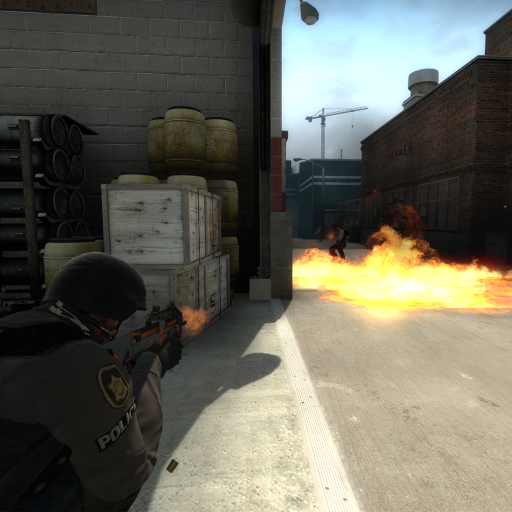
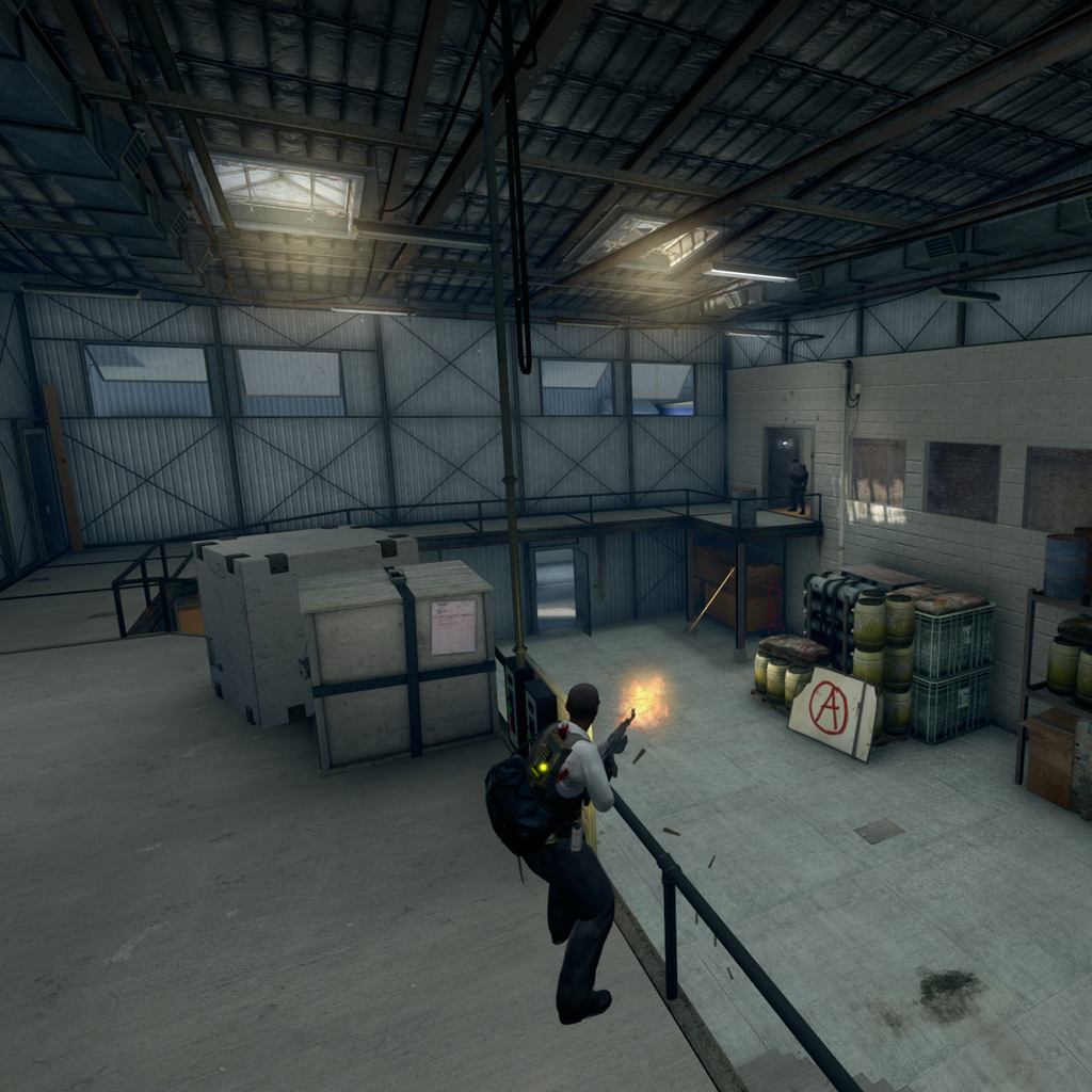 On the terrorist side of gameplay, flashes and smokes become an extremely important component for gaining control of areas. The timings on Facade can place counter terrorists at just about any entrance to either bombsite as terrorists approach. To counter this, there are multiple spots to throw smokes through in most locations on the map. There are a few locations on which a correctly placed smoke can completely guard or block an entire path. We also designed the ceilings of facade to be open instead of blocked off with skybox. This allows smokes and flashes to be thrown over almost any building and at any height without hitting silly invisible walls. With practice this can offer opportunities for creating cover or distractions far across the map, even early on in a round. Each bombsite on de_facade has a unique and somewhat counter intuitive pattern of gameplay. For example A site, though it is the smaller bombsite, lends more to riffle play. Since the cover in the site is based on height differences, players mainly get cover by distancing themselves from opponents. This both hides the majority of the player’s body, and makes close range weapons less effective; making riffles ideal. Alternatively, B site plays out very chaotically in high action and is often where pistol rounds take place. Because there is so much cover in B site, many skirmishes happen in close range. However, due to it’s size, both short and long ranged weapons can be viable if played correctly.
The Future of Facade
At the end of the day we worked our asses off to put de_facade together. We hope that it reflects the hundreds of hours that it took to create, and that you the community enjoy playing it for a while to come. As we mentioned before, this level couldn’t have been made without players who truly love the game. Thank you to all of our testers and thank YOU for supporting our map and reading this article. We hope you enjoyed it. If you haven’t checked out facade yet, you can find it here on the Steam Workshop.
With all of the work that we, and the community, have already put in, it would truly be a shame if Facade wasn’t the best it can be. If you have any suggestions or comments on our map please shout out to us on the steam workshop page in the suggestions box thread.